Data Visualization of Airbnb Listing using Tableau
Tableau Interactive Dashboard
Summary
The project is focused on helping new Airbnb hosts in Sydney gather valuable insights and strategies to maximize guest bookings. The goal of the visualization system is to empower hosts with the key factors that drive bookings and ensure that they can run a profitable and sustainable accommodations.
Data Acquisition
The original Airbnb Dataset contains data dating back to 2009. However, the visualization system will be limited to only data from 2017 to 2021. The objective is to gain an understanding of the current state of the Airbnb market in Sydney, and the recent pre-covid years are the most relevant for this purpose. As a result, all charts in this section only display data from the years 2017 to 2021.
Section 1
Objective and Assumptions

Key Takeaways
❖ Pittwater and Manly are the only two neighbourhoods in Sydney (the state) found in the top five highest average price neighbourhoods and the top five most reviewed (most popular). Pittwater has the highest average price and is also the third most reviewed, while Manly is the fourth most expensive and fifth most popular.
❖ However, Sydney (the neighbourhood) is still significantly more popular compared to the other neighbourhoods.
❖ Potential hosts could consider owning an Airbnb listing in either Sydney, Pittwater, or Manly, depending on their desired booking price.
❖ Regardless of the location, owning an entire home/apartment is generally preferable. The stacked bar chart illustrates that over 70% of Airbnb guests prefer booking entire homes/apartments, regardless of the neighborhood's popularity or price.
Section 2
Objective and Assumptions

Key Takeaways
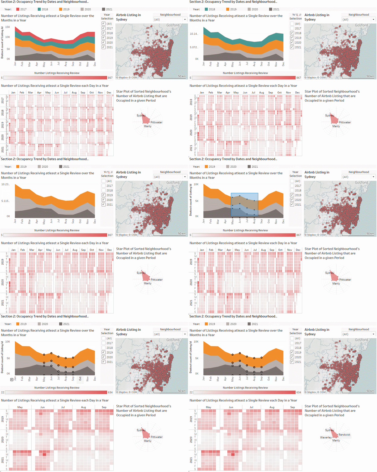
❖ The Airbnb listings in Sydney (the state) are most occupied in December and January, coinciding with the holiday season.
❖ During the least occupied period (April to September), Sundays tend to have more Airbnb listings receiving reviews than other days of the week.
❖ No matter the year or week, Sydney (the neighbourhood) remains the popular choice.
❖ These insights lend further support that owning an Airbnb listing in Sydney, Pittwater, or Manly is a good option due to its popularity throughout the year.
❖ Furthermore, hosts could consider adjusting their booking price on weekends during non-peak periods, as some weekends still see high occupancy rates according to the Calendar Heatmap.